Buying train tickets is harder than it should be
/I hate it when things make me feel stupid. Buying train tickets online seems to be one of these situations. I wanted to buy some tickets to go from from Hull to London on Saturday. My normal approach (use the phone) was thwarted by the error message “Ooops. Something went wrong” when I tried to complete the purchase.
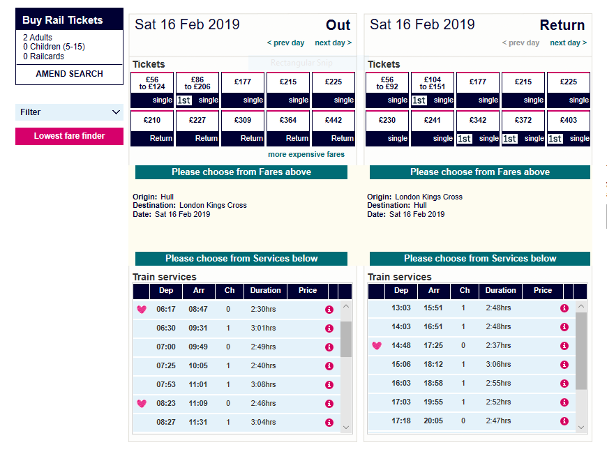
So I headed off to the web. And was met with the above. This is the page for Hull Trains, but lots of companies use the same UI, so I’m not happy with them either.
Questions abound. Why are the prices not shown? What do the buttons on the top actually mean? Why is the page called a Mixing Deck? And what on earth happens when you press the “Lowest fare finder”? Ugh.
After a bunch of experimental clicking and tweaking I finally managed to select the same trains that the phone wouldn’t let me buy. And I was told that there were no tickets available at that price. So “Ooops. Something went wrong” actually means “I’ve told you about some tickets that aren’t actually available".
So, train people, just a word here. When I go to a site to buy some tickets I want a list of journey options with a price next to each one. And I don’t want you to show me journeys that, for marketing reasons, you’ve decided not to sell me any more.

