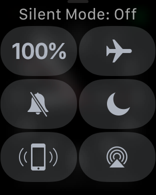
Appalling UI Design
/Ugh
I still like my Apple Watch. I still like my Apple phone. But mainly for what they can do, not the way that they do it. Going back to my Windows Phone always puts a smile on my face, as I get to use a user interface that is properly usable and scaleable. Then the smile disappears when I find I can't read books or do anything much with it.
For a company that prides itself on design Apple should be ashamed of the above screen. Take a look at it and decide whether or not the watch will make sounds. After a while you might deduce that if silent mode is off, the watch might make sounds. Although you might also be confused because the icon shows a bell with a line through it which might imply silence. The icon is not lit up - although it can be - something that you need to know to make sense of what is happening here.
Ugh, ugh, and ugh. Anyone who thinks that user interface design is easy should take a long hard look at this and consider how they would do it. They are almost certain to come up with something better than this mess. Me, I'd take away the icon and use the words "Noisy" and "Silent", it would be a lot clearer for your's truly.
Update: Turns out I can't spell appalling. That's ..... not good.

